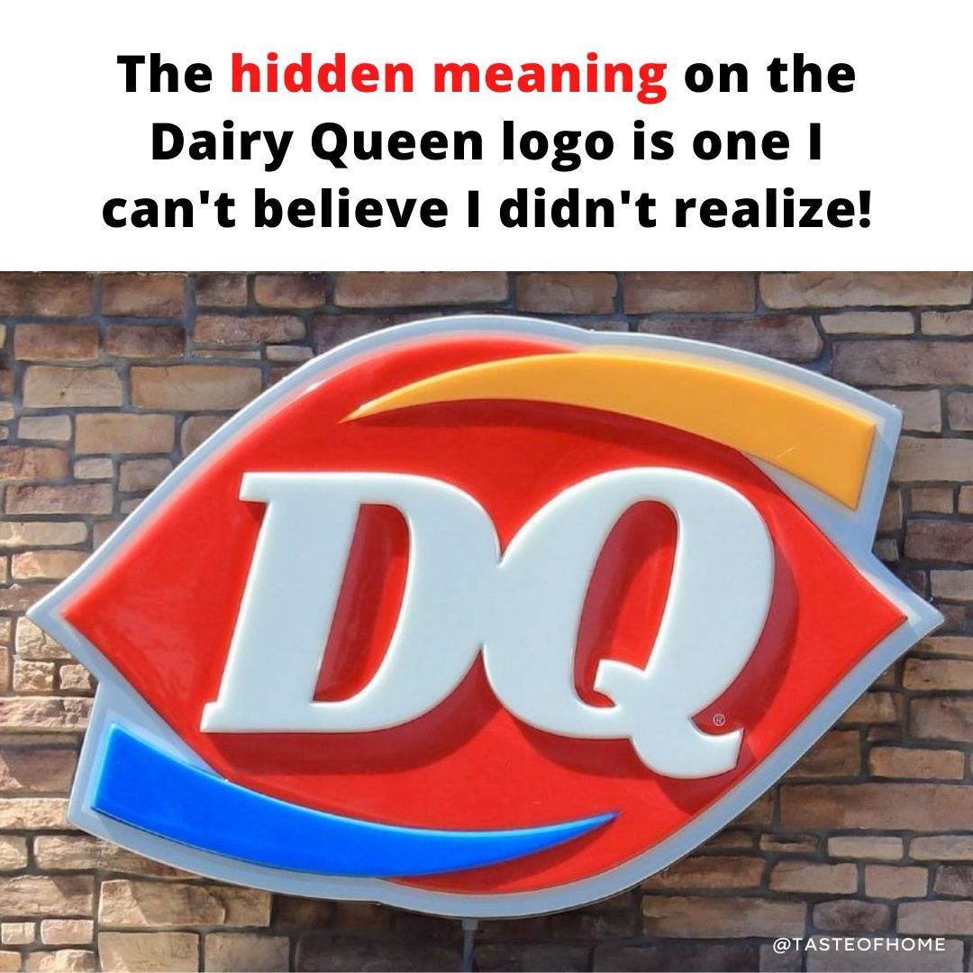
The red shape still symbolizes lips as it has since the logo that debuted in 1960. But it’s the colored lines that hold a secret meaning. The orange arched line represents hot foods, while the blue arched line represents cold foods, like DQ’s popular soft serve treats. It’s a modern version of the chain’s 1960s logo, and ultimately, it’s become one of the most recognizable symbols in any small town.